The ambigram I’m using for my logo is actually the first one I ever designed years ago in high school. It’s tricky business designing a word that can be read both right-side up and upside down, but I was curious to see if I could create one for myself. The original drafting has since been lost, but I recount my designing here.
True, I was a layouts person for our newspaper at the time, but my typography and calligraphy knowledge was limited to serifs, kerning, and like… capitalization. Still, I noticed immediately that there were a few letters that rotated naturally to the same or other letters. d/p, e/e, o/o (duh), t/t (to an extent), m/w, A/v, etc.. The next thing I learned was that if you add a dot to literally any stem, it looks like an ‘i’. We rely very heavily on the shapes of the tops of letters, so much that you can throw pretty much any stroke on the bottom of a stem and let our minds ignore it.

In fact, while creating ambigrams, sometimes it felt like just finding out how much I could embellish of basic letter forms while leaving them recognizable. We’re lucky that our brains are extremely good at recognizing patterns and words it thinks are there, even if they actually aren’t. An example:

Here, the “dr” are connected on the bottom but still recognizable because of the tops of the letters , the “e” and “a” are clear, and the last diamondy blob looks enough like an “m” that our brains do the rest of the work.
Anyway, the natural letter complements and some other natural letter combining (e.g. rn/w, u/ri, iti/w, AI/N), are the tools that the algorithmic ambigram generator websites use. Those websites are awesome, and I admire ingenuity and complexity of being able to generate nearly any ambigram on the fly. Their typefaces have thousands of letterforms, but in the end, nothing beats hand-designing one.
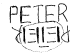
So… what about my name? I was lucky that the middle three letters of “Peter” flip naturally, and the P and R don’t look so shabby flipped either. These simple strategies and quick sketching led me to my initial design, which honestly looked pretty tacky.

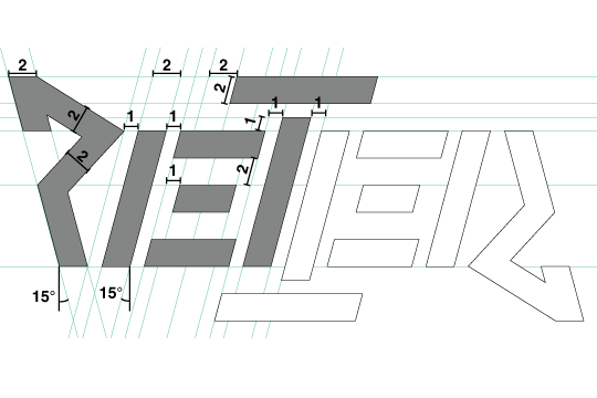
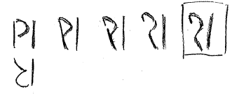
I figured it was time to attempt all-caps! My first step: write my name right-side up and upside down next to each other and start matching strokes that can correspond.
I saw immediately that there were many straight lines in my name and that the 3 horizontal strokes of E are unmistakable. In fact, to make them into Es, our minds automatically associate the vertical stroke to the left of it.
Once again, the middle 3 letters were nearly effortless. I moved the T cross stroke up so that its vertical stroke fully dissociates when upside down. By the principle of insignificant bottom strokes, that cross becomes a pseudo-underline when upside down. However, the P was key, as studies have found that hmuans rley haevliy on teh frist and lsat lteetrs of wrdos to raed txet.
Looks like I had it. Initially, the P looked way too skewed, so to make the P take precedence, I tilted, no, italicized everything else.
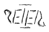
‘Twas all coming together, I thought. Finally, to make everything coherent, made all the strokes in the P/R straight, I capitalized the P, and assigned rigid measurements, alignments and widths to everything. The cool thing about ambigrams is that you only need to vectorize half, then copy and rotate it to finish. et voila.

Ambigrams are fun to develop but extraordinarily difficult for someone as inexperienced in typography as me. Still, I kept at it for a little while, developing maybe 15 or so in high school and a few more in college.
-Peter
PS. I hope you enjoyed this design processed post, inspired by the ever ingenious Benson Chou/Imaginary Zebra and his design process blog posts. I’m still trying to figure out the direction and style of my blog, but this is one topic I just had to get out of my system. hehe
PPS. lol is a natural ambigram. lol