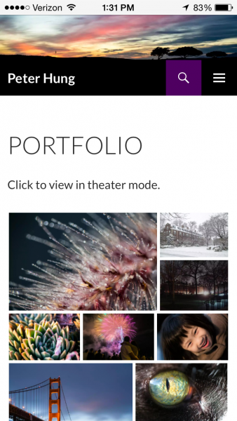
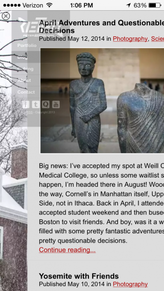
It’s been on my todo list for almost half a year now, but I finally updated my website’s theme to be responsive and display properly on small windows. Yay!

The new theme is based off wordpress.org’s default theme “Twenty Fourteen”, but with some extra plugins enabled for the tiled gallery front page, the lightbox feature that the previous blog posts were written for, a revamped contact box, and changed color scheme (obviously it has to be purple). I’ve also adopted my silhouette-y sunset photo from January as my permanent banner. It kinda summarizes my photographic taste pretty well: bland landscapes with unusual lighting.
Sadly, gone is the full-screen background slideshow. Also gone, weird behavior of the full-screen background slideshow, stationary sidebar, and hard-coded column widths.

