Today, the beginning of the second year of med school, also marks the end of a very curious summer. In particular, let me tell you about the graphic design part of it.
In May, I set before myself an ambitious goal: learn graphic design. As you might guess, that goal wasn’t very thought out. Graphic design is hard. Like, really freaking hard. It amounts to every kind of conventional visual art form — painting, sketching, lettering — but tossed together together on a limitless digital canvas instead. I only had modest typesetting experience; I used to layout pages for my high school newspaper, which amounted to copy-pasting stories in InDesign and measuring in pica boxes (lol). I had no idea what I was in for.
Graphic design is everywhere. Walk down the street and just appreciate the graphic design details in store fronts, packaging, signage, book covers, websites, pamphlets, and everywhere else. That was my preferred method of learning, but I soon learned that “observe and imitate” (how I learned photography) isn’t so simple for design. Why?
Graphic design is profound. Photography is, by nature, based on observation, and therefore relatively easy to start from scratch. Graphic design is, by nature, creative. Being able to design means being able to pull from all of your visual and emotional experiences and distill what you want to convey into symbols, choices, and images, then applying that to words and pictures and shapes artistically.
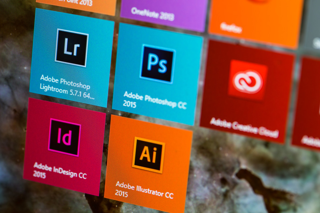
Graphic design is hard. Take all of those designer considerations and combine it with with an immensely power digital toolbox: Adobe InDesign, Illustrator, and Photoshop. And you thought photography was hard? A camera has like 10 buttons. Illustrator’s keyboard shortcut reference alone is 42 pages long. The power behind each of those programs is incredible and kind of unmanageable.
Needless to say, I didn’t succeed. =( Now, at the end of the summer, I have a grasp of typesetting and rudimentary vector art skills, but everything else? Psh.
But, thankfully, I don’t think I failed either. I set out to learn by practicing, and so when summer began I picked up projects that might prove useful. Those were projects that benefited students or groups here at Weill Cornell, and they have started to roll out recently. There were two big projects:
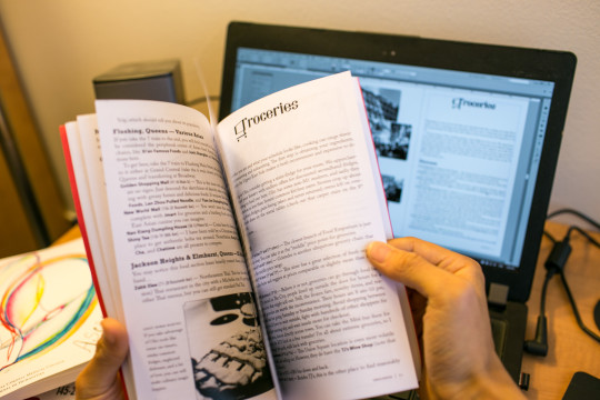
A Guide to NYC. While moving out of our first year dorms, I “stumbled” upon a little red handbook that I was given when I started med school. It contained little tidbits of information about NYC for new students written up in a playful tone. Unfortunately, it was written 5 years ago and typeset basically in various weights of Times New Roman, and that packaging kinda turned off my classmates and me. I wondered if a facelift would make the handbook more accessible and therefore more useful. That “facelift” turned into me re-researching tons about NYC, pooling submissions from my awesome classmates, writing 15,000 words of copy, curating hundreds of photos, and doing about 160 hours of work. (It was extra ironic/humorous/frustrating working on it in St. Louis) However, I hear that new WCMCers are using it at least a bit, that makes me quite happy.

Ascensus, WCMC’s Journal of Humanities, was the other big project. Arguably, Ascensus started this all because I had signed up earlier to do the layouts for the journal, and that’s what prodded me into trying design instead of, say, underwater basket weaving. It has been a privilege to work with our beautiful submissions and to do my best to present them well.
Today was the first time I set hands on a physical copy of Ascensus, and it felt so selfishly gratifying to flip through the professionally-printed full-color perfect bound booklet, look at the non-lining numerals and small-caps header with a 0.25 pt line and think to myself. “I did that!” hehe, little joys.
I’m far from a certified graphic designer, but I’m glad and proud that what I’ve learned thus far can benefit my classmates and friends here at WCMC. Now, back to learning more medicine!
